How Close Do You Live to a Maniac Driver?
Am I bad driver? You decide
By : Drew Fransen
America. The land of freedom, excessive indulgence in barbeque food, and cars. The US has 4.4% of the world’s population and a staggering 28% of the world’s passenger cars. I am certainly no exception to this trend. In 2018, I traveled 17,856 miles by car, 72% of the way around the world.
Throughout this arduous journey, I recorded my location data on an app called MyCarTracks and exported part of it (mid 2017-early 2018) to figure out exactly what those miles looked like.
Here is a histogram of my driving speed for a period of time in 2018:
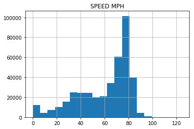
This was generated with the Pandas command
data.hist(column='SPEED MPH', bins = 20)
Any data points in excess of the legal speed limit were created when my brother was driving. Also, a lot of this data is from when I drove through Texas which has a speed limit of 75-85 mph and even then, sees following the rules as communist.
The speed range I spend the most time at by a significant margin is 75-80 mph followed by 70-75 which makes sense. Another interesting observation is that there is a small peak around 40 before dropping off slightly until about 65. This makes sense because I’m usually either driving on city roads with a speed limit of around 40 or a highway with a 65+ mph speed limit.
Lastly, I am pretty lucky to spend almost no time in heavy traffic. Very little time was spent stopped or going less than 25 mph. You can probably guess I don’t live in LA (and I bike more than I drive around town and mostly drive for longer distance trips).
Another interesting (ok maybe not) graph is a boxplot. This was generated with the Pandas command
data.boxplot(column = 'SPEED MPH')
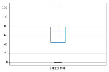
Yes, the top speed was in excess of 120 mph, but it was completely legal because I drove on a track.

Using the command
data["SPEED MPH"].quantile(---)
I calculated that I only spent only 10% of my driving time below 28 mph, 30% below 49, 70% below 75, and 90% below 81. That make sense because the majority of miles were on the highway. The mean was about 60 mph.
Furthermore, I was interested in how the average speed was broken down by state. I used a service called “GeoPy” that can look up the location of a given latitude and longitude. I wrote this loop
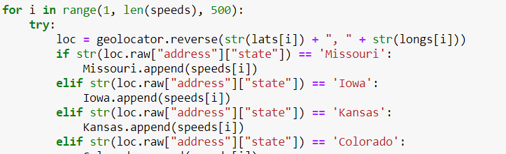
Which appends each 500th speed reading to the appropriate state. I then took the average of each array to this data:
| State | Miles per Hour (average) |
|---|---|
| Missouri | 54.54029593288786 |
| Iowa | 56.55062841533332 |
| Kansas | 77.43424157473686 |
| Colorado | 71.89231862642308 |
| Illinois | 67.35232563218607 |
| Wisconsin | 69.67174718333335 |
| Indiana | 63.832624306666666 |
| Kentucky | 80.2290458662 |
| Tennessee | 58.99196788381081 |
| Oklahoma | 76.41562372558823 |
| Texas | 82.68259975562499 |
| New Mexico | 68.60248894518517 |
| Arizona | 48.08735976064286 |
As you might guess, the highest average speeds were in Kansas, Kentucky, and Texas while the lowest was in Arizona which involved some traffic and Missouri where I drove locally.
Here is a map generated using “Folium” that gives an idea of the average speed for each state.
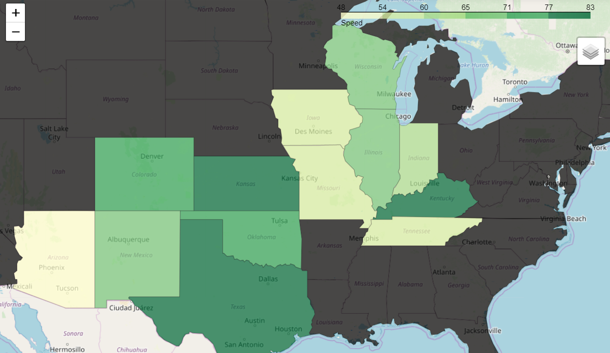
It was generated using this code:

A CSV file was created for the average speed data and the state boundaries were imported from a JSON file.
Finally, I imported the data points into a location map using the code
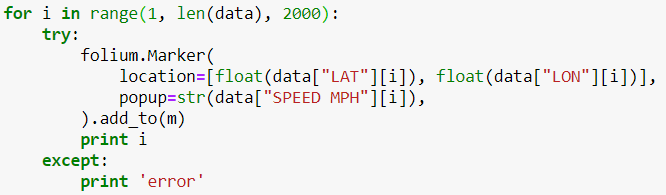
It generates an interactive map that can be exported to an HTML, but I’m not including it due to privacy reasons.
Please remember check back often in case somebody posts data that is actually useful.